UNC CHAPEL HILL | STEVEN D. BELL HALL
Steven D. Bell Hall will be a new building at UNC Chapel Hill’s Kenan-Flagler Business School. Surface 678 was the landscape consultant for the project, for which I was the main landscape designer, working under the direction of Robert Pratt, the project manager.
This was a unique project within the studio in the sense that we carried it from advanced planning all the way to construction documentation. Construction administration will follow – however my tenure at Surface ended prior to construction.
My long-term involvement with this project taught me about siting a building; analyzing a site’s existing conditions and identifying design opportunities; developing and iterating concepts; modeling those concepts; communicating design ideas through clear high-level graphics; drafting and BIM management, multidisciplinary coordination with architects and engineers, and delegating tasks to others.
*Steven D. Bell Hall was previously referred to as the “McColl Building” and may be labeled that way below.
PROJECT DETAILS:
LOCATION: CHAPEL HILL, NC
WHEN: 2018-2022
TYPE OF WORK: PROFESSIONAL
ROLE: DESIGNER
LANDSCAPE TEAM: ROBERT PRATT
CLIENT: UNC CHAPEL HILL / KENAN FLAGLER BUSINESS SCHOOL
DESIGN PHASE: AP-SD-DD-CD
CONSULTANT TEAM: LMN, LS3P, NV5
ADVANCED PLANNING (AP)
SITE ANALYSIS
In 2018, I visited the site for Kenan Flagler’s business school expansion for the first time. At that point, the location for the proposed building had not been selected. The initial design decision was site selection. To inform that decision the project team analyzed the topography, the quality of the existing vegetation, the hydrological elements on the site and the existing pedestrian and vehicular circulation patterns.
Taking a close look at topography was key to inspiring a big design move. The team realized that the existing elevation of the McColl building (+422) matched an elevation on Blythe Drive (+422) at a point close to the existing parking deck. One of the design challenges we faced when selecting the site for the project was to select a spot that would better connect the business school to the rest of UNC’s campus, (the business school is south of central campus, and is tucked away). We saw an opportunity to connect the existing business school area with a “bridge” that could be accessed via Blythe Drive, which is much easier to access from central campus. Besides this key finding in terms of existing elevations, we mapped areas with steep slopes. In general, it’s more difficult to work on steep topography.
Another factor we took into consideration when siting the building was the impact of the new development on existing woodlands. From the onset of the project, one of the major goals was sustainability. We wanted to preserve as many trees as possible and avoid disruption to the most valuable ecological areas. Studying the existing vegetation in the area, we found that the trees closer to the existing parking deck were younger, smaller, and therefore easier to replace than the trees further west. Among other factors, this finding pushed us to site the proposed building adjacent to the existing parking deck avoiding disturbing the old growth forest.
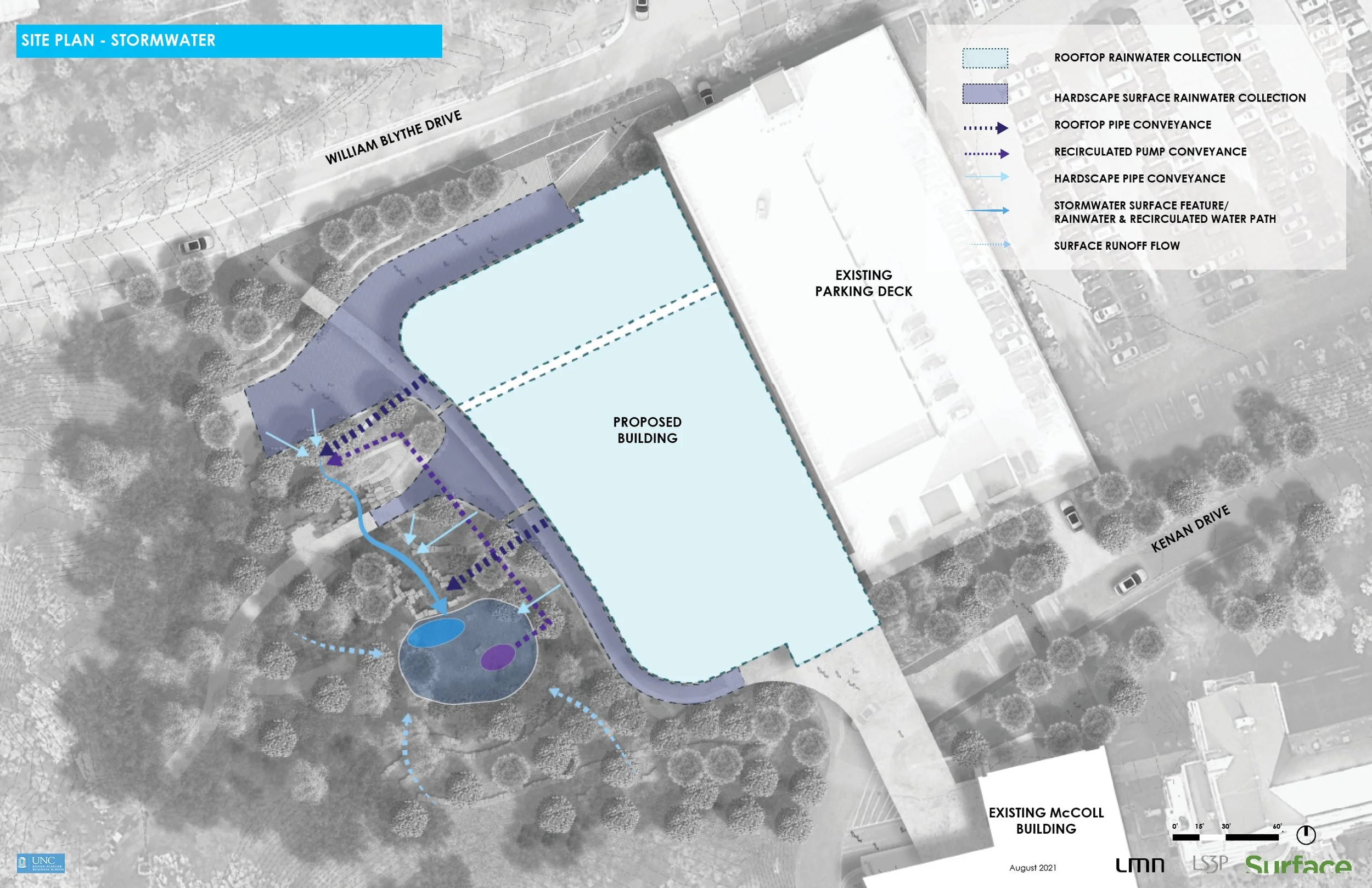
Stormwater management is always considered carefully by landscape architects. It was important for the design team to understand how stormwater moves through the site early on, and to incorporate that into the landscape design. We mapped drainage patterns and identified stream and swale centerlines.
COMPOSITE ANALYSIS
Once we had mapped and understood these different systems at play on site, we layered them to create a composite analysis. We also factored in some physiological conditions such as wind and solar orientation. The composite site analysis was helpful in the next step, which was identifying design opportunities.
SITE OPPORTUNITIES IDENTIFIED
The site opportunities map takes the site analysis findings and starts to suggest a strategy for design. As we moved on to our first site concepts, we kept these opportunities in mind.
ADVANCED PLANNING (AP)
SITE ANALYSIS
SCHEMATIC DESIGN (SD)
early DESIGN concepts
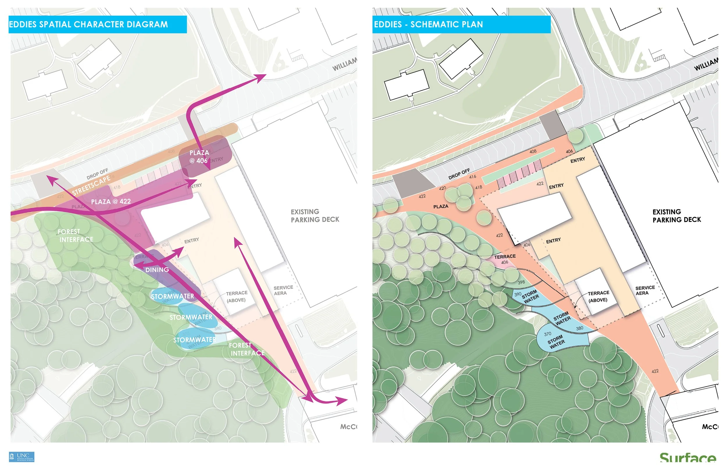
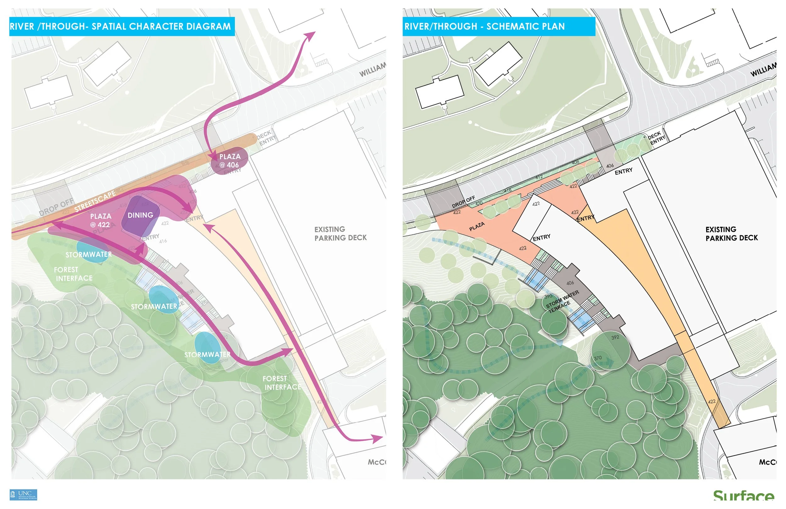
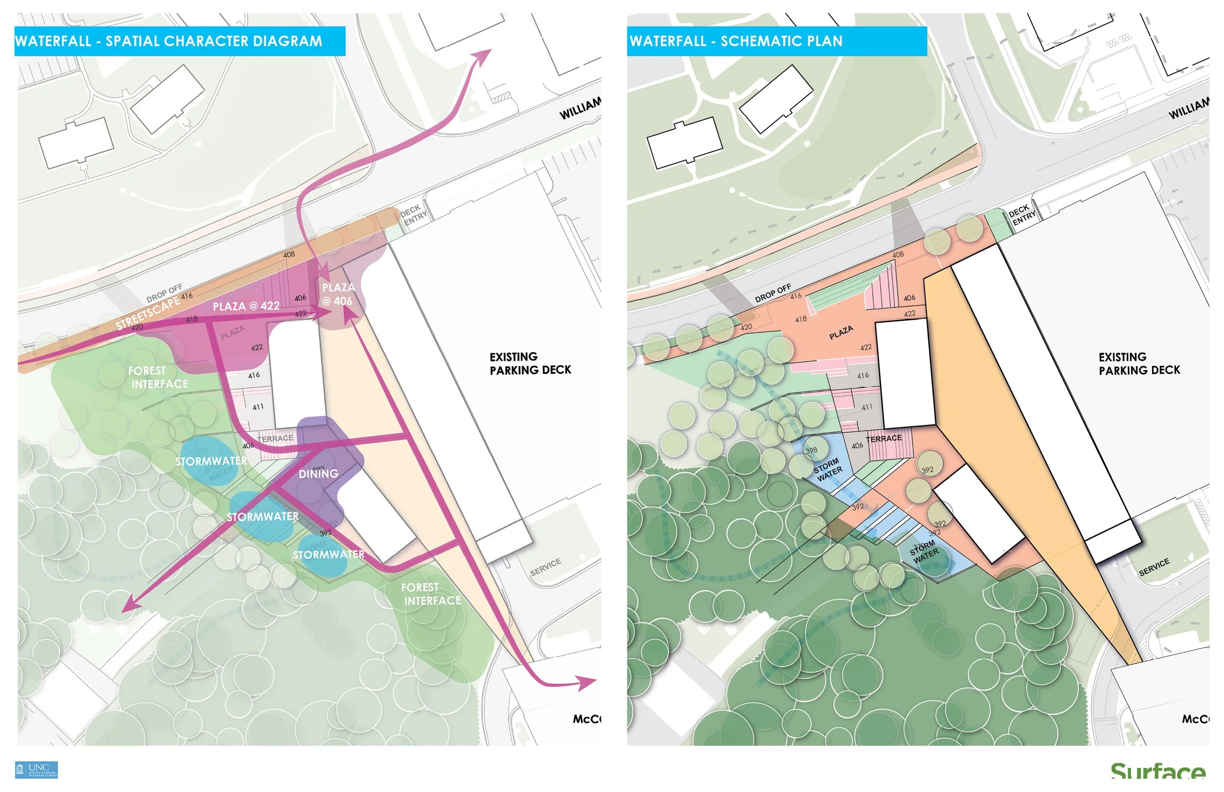
Below are three early design concepts for the building and landscape. Surface 678 (landscape) worked closely with LMN (architect) on these designs. At this early design stage there’s a lot of experimentation with concept and form, though the designs all attempt to incorporate the opportunities previously identified.
One of my first times on site was to do a “pedestrian count.” The idea was to map existing circulation patterns through direct observation. This involved a team of three people, stopwatches, clipboards, a notation strategy, and coordination. After spending the morning on the field, I spent the afternoon digitally plotting our data and presented it on a plan in a diagrammatic format. We then studied our findings and noted points of concentrated pedestrian activity, frequency of path use, existing site/building access points, and most common modes of arrival or types of transportation.
We noticed that a lot of people were arriving to campus by car and either entered the area through the parking deck or were dropped off at the existing drop-off area. We speculated that this dependence on cars was largely due to the business school’s disconnection from the rest of campus.
ADVANCED PLANNING (AP)
SITE ANALYSIS research methods - pedestrian counts
A note about the site analysis graphics:
I created these graphics using QGIS, AutoCAD, Adobe Illustrator, and Adobe InDesign.
An important part of the design process is testing what you’ve made. If implemented, does it solve the problems you previously identified?
Visualizing the problems you’ve found and showing how your design addresses them is an effective way of communicating the benefit of your design. Ultimately, I think testing your design in this way is how you begin to know if it’s a good design or not.
I enjoy making graphics that show the ‘existing’ condition and the ‘future’ condition after a design intervention. In the graphics to the left you’ll see the existing circulation patterns mapped. Notice that the connections to the existing business school area are greatly amplified in the future by the proposed design. A specific goal of ours was to create better connections between the business school and the rest of campus, so seeing that this design could achieve that convinced us to move forward with that direction.
SCHEMATIC DESIGN (SD)
TESTING THE DESIGN
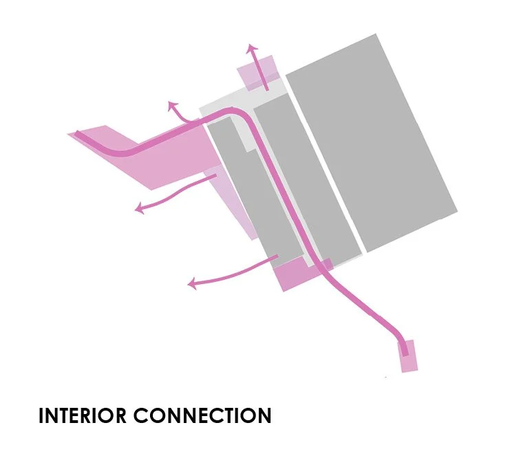
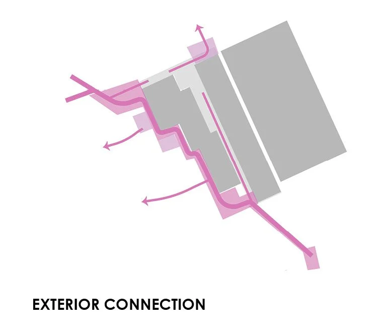
To the left is a similar set of graphics that look at existing and future arrival sequences. In the existing condition, the options for getting to the business school are limited, and there’s no connection through Blythe Drive. In the future condition there’s a vehicular entrance to the deck from Blythe drive as well as a pedestrian connection from Blythe drive all the way to the existing McColl Courtyard - what’s best, all at the same elevation! That’s spectacular for accessibility. Below are some diagrammatic circulation options for how people would actually move through the design from Blythe to the McColl Courtyard.
The next phase was better understanding the proposed solution three dimensionally. This meant modeling the landscape design in three dimensions. For this task I used Rhino 3D, which the architects were also using.
Once we had a working Rhino model we continuously exchanged .3dm files with LMN, the design architects on the project. This was a way of ensuring that our design development was in sync and that there were no conflicts with our designs. Additionally, it was nice to see the models progress in tandem. When the architects added more detail to their model, such as the locations for window mullions or columns, we worked to make alignments with those features in our landscape model. The idea was to have a smooth, seamless transition between the indoors and the outdoors. Our landscape design was the key transition element between the existing natural forest and the new building.
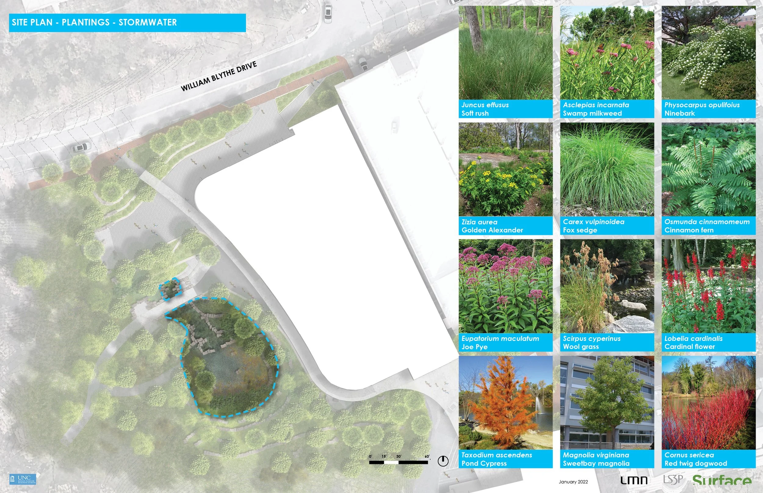
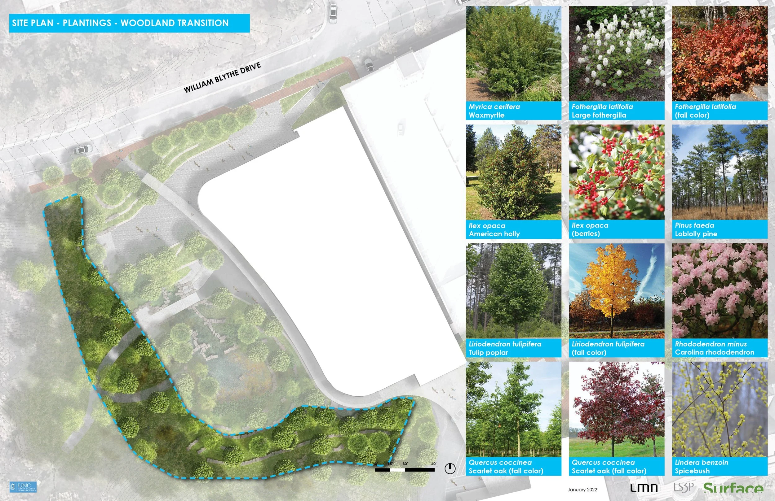
One of the key design concepts for the landscape became this smooth transition for formal design to nature. We studied materials and material transitions that could help achieve this effect. Closer to the building we would use more ‘polished’ or ‘orderly’ materials such as concrete or brick, and closer to the woods we would use rougher materials like stone, boulder, and gravel. The planting palette was to follow this concept as well, with more formal planting designs being closer to the building and ‘wilder’ plantings suggested for the forest edge.
A note about the graphics in this section:
I am the author of the vast majority of the graphics presented on this webpage, however, I was not the sole illustrator of the sections to the left which were made by Nathan Holst who used my 3D model to cut and illustrate the sections.
DESIGN DEVELOPMENT (DD)
DESIGN DEVELOPMENT (DD)
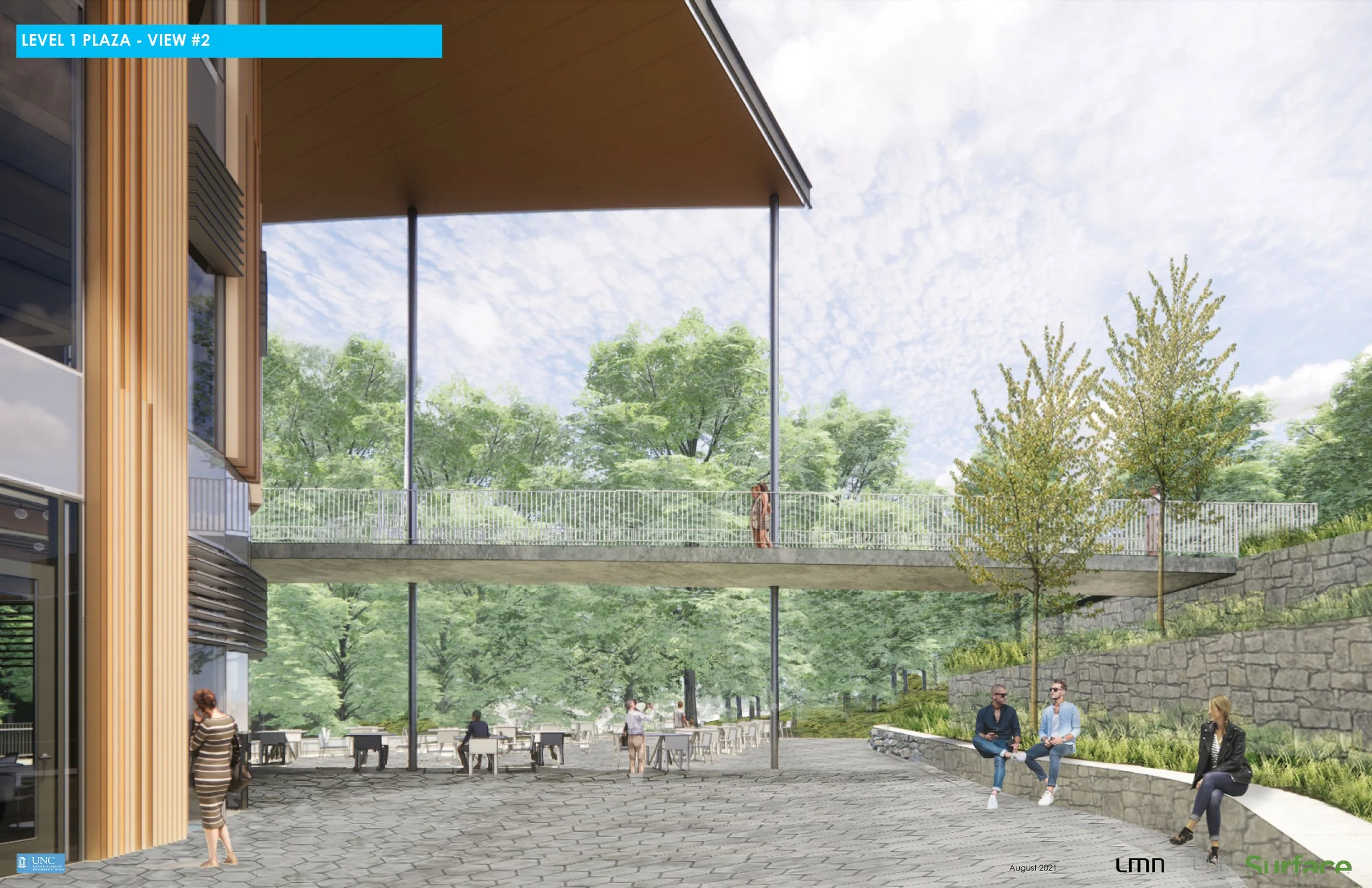
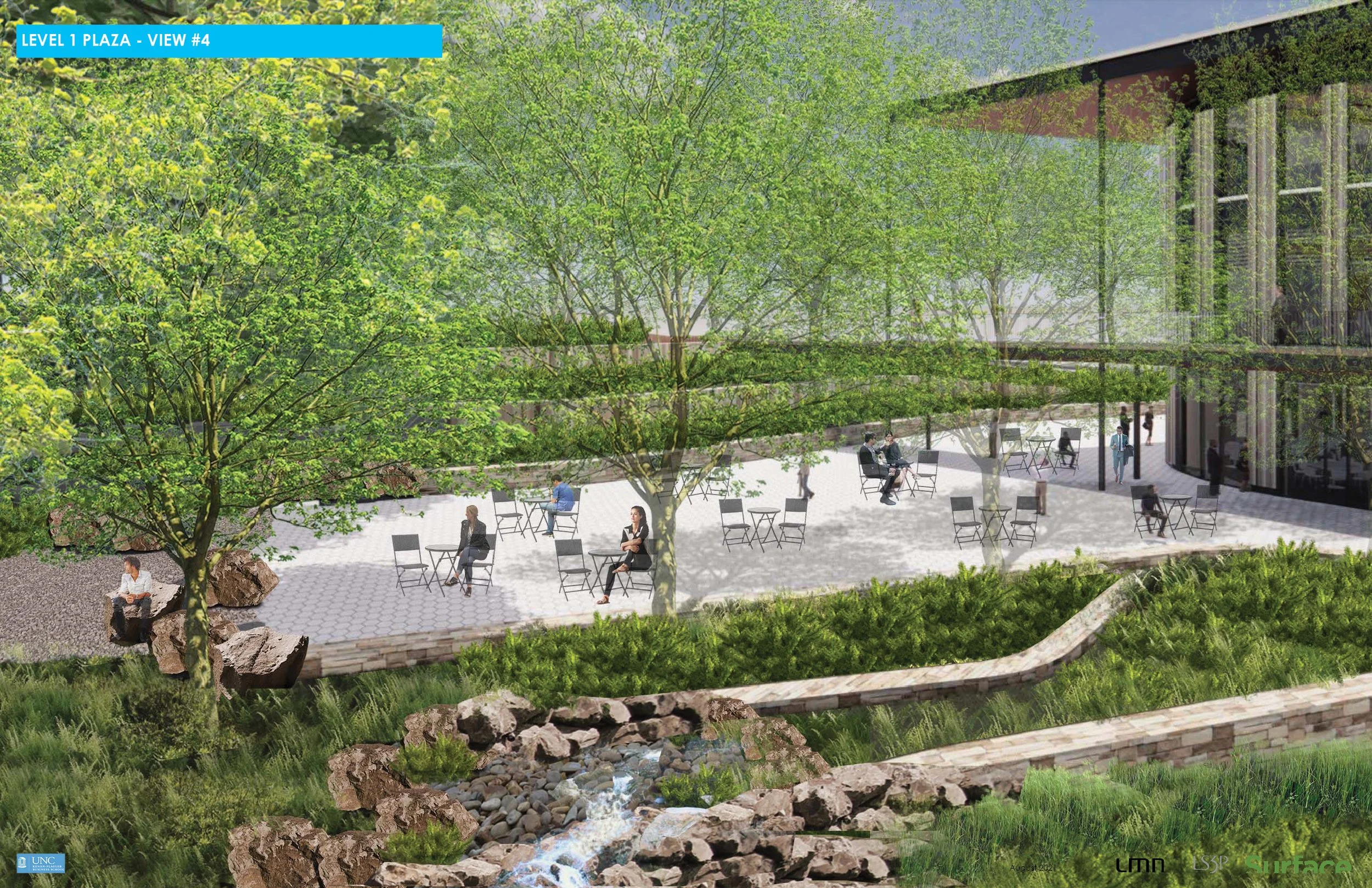
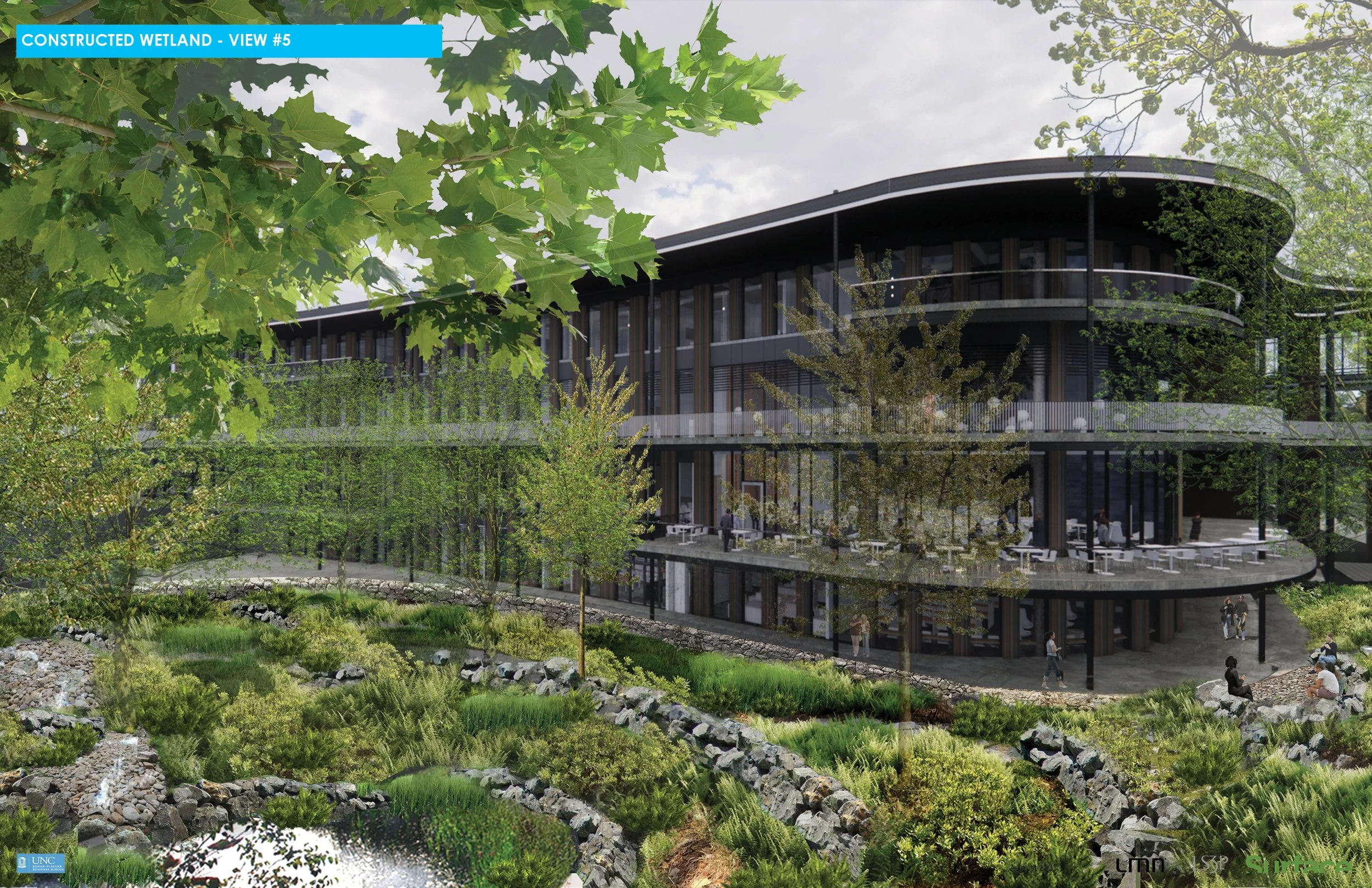
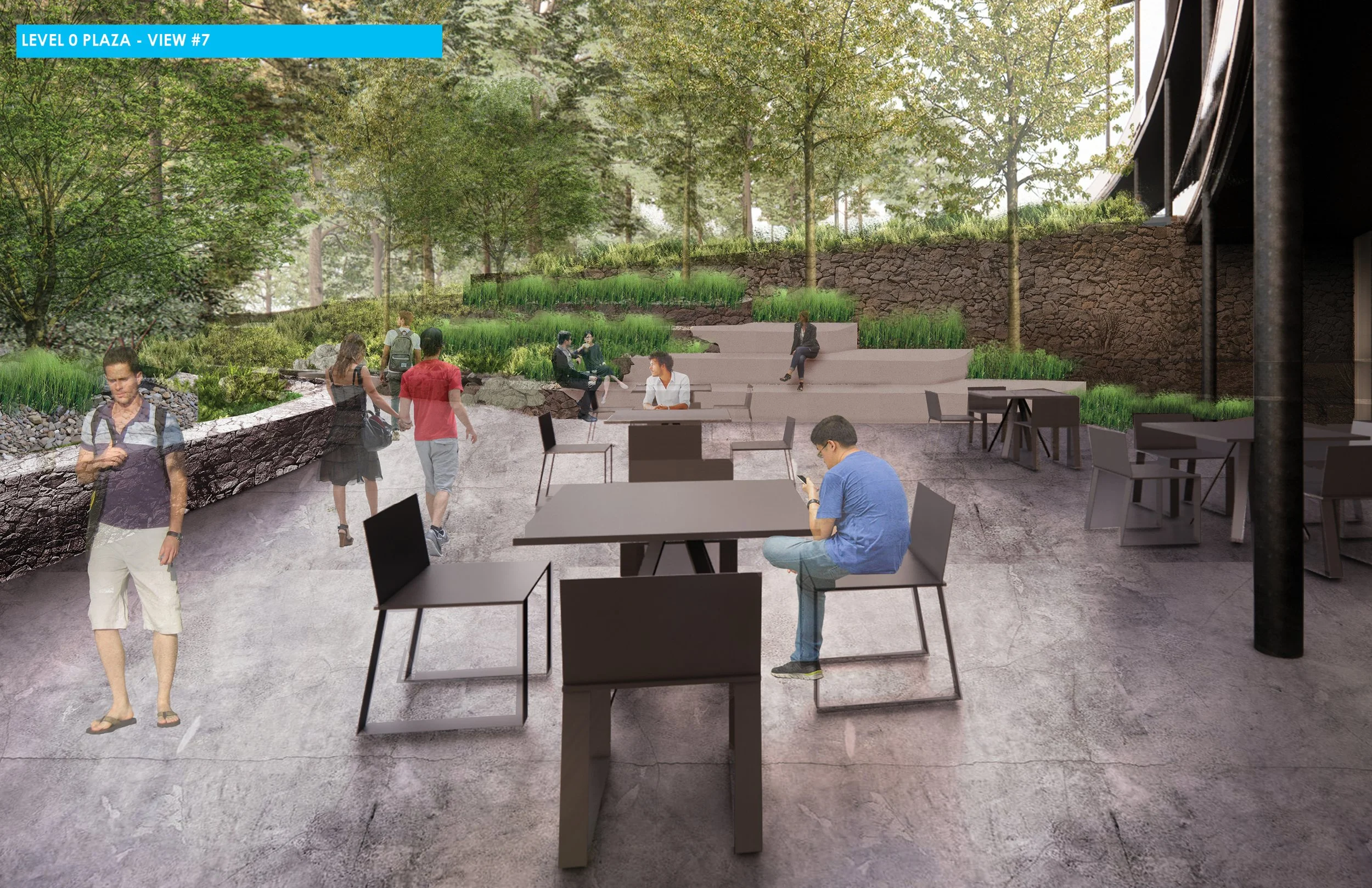
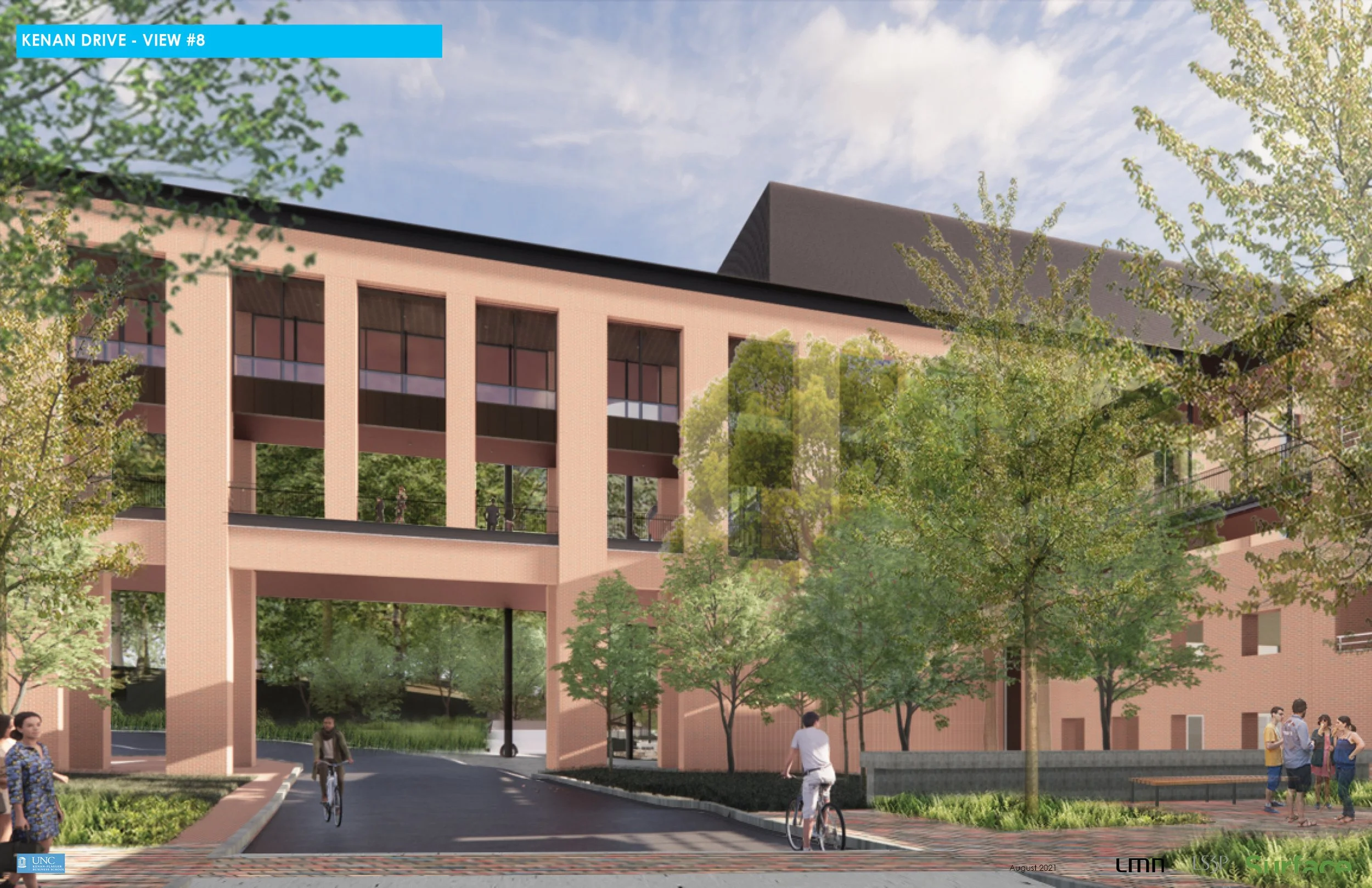
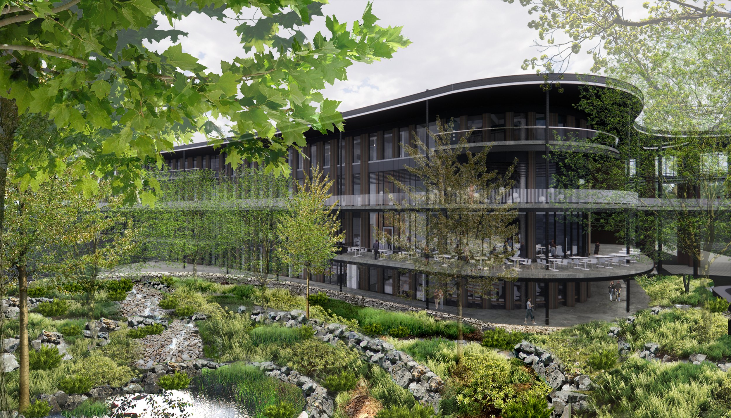
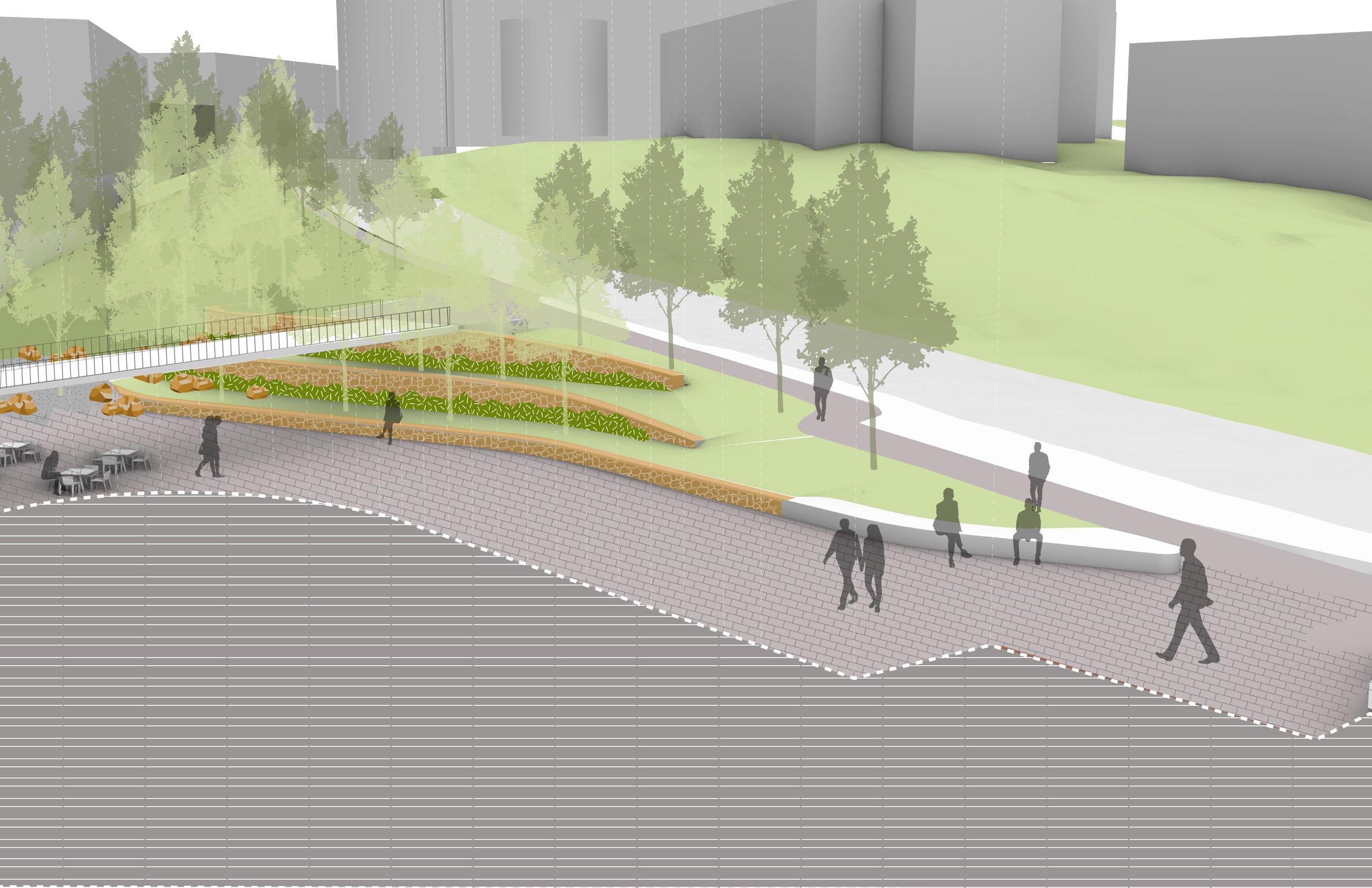
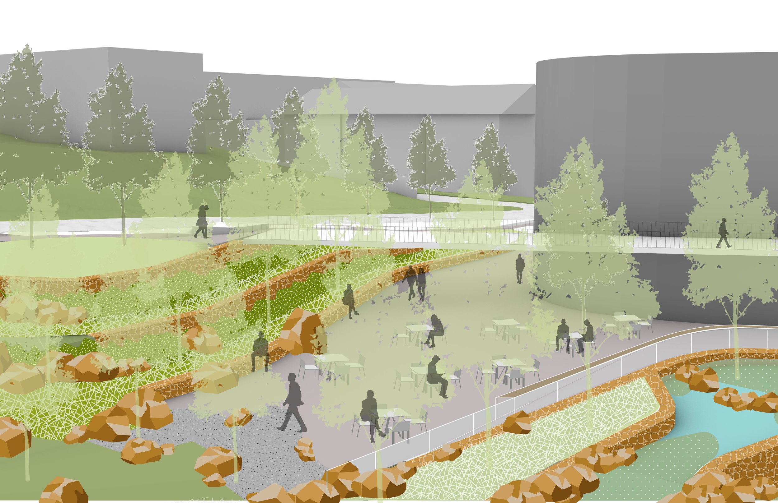
Photo-realistic renderings are a great way of communicating the project to the public. They’re great marketing materials and tend to get people very excited. The final renderings are a team effort. The process for creating these renderings is highly collaborative and involves frequent communication and file exchange with other design consultants, in this case the renderings were a collaboration between the architects at LMN who were responsible for the architectural design and the landscape architects, my team.
A 3D rhino model served as a base for renderings. To ensure compatibility, I exchanged 3D models with the architect. Once we reached a complete design iteration for the landscape, we shared our model with the architects. The architects incorporated our model into theirs and then sent us a rendered view of the building that included our proposed design. However, the architect’s renderings did not represent the landscape the way we envisioned it (see image below), so we used Photoshop to edit the renderings and show plants and hardscape materials that were closer to our design.
Below are several renderings that I worked on in this manner and to the left is a key plan that indicates where the view of each rendering is from.
DESIGN OPTIONS - TESTING DIFFERENT PAVEMENT PATTERNS
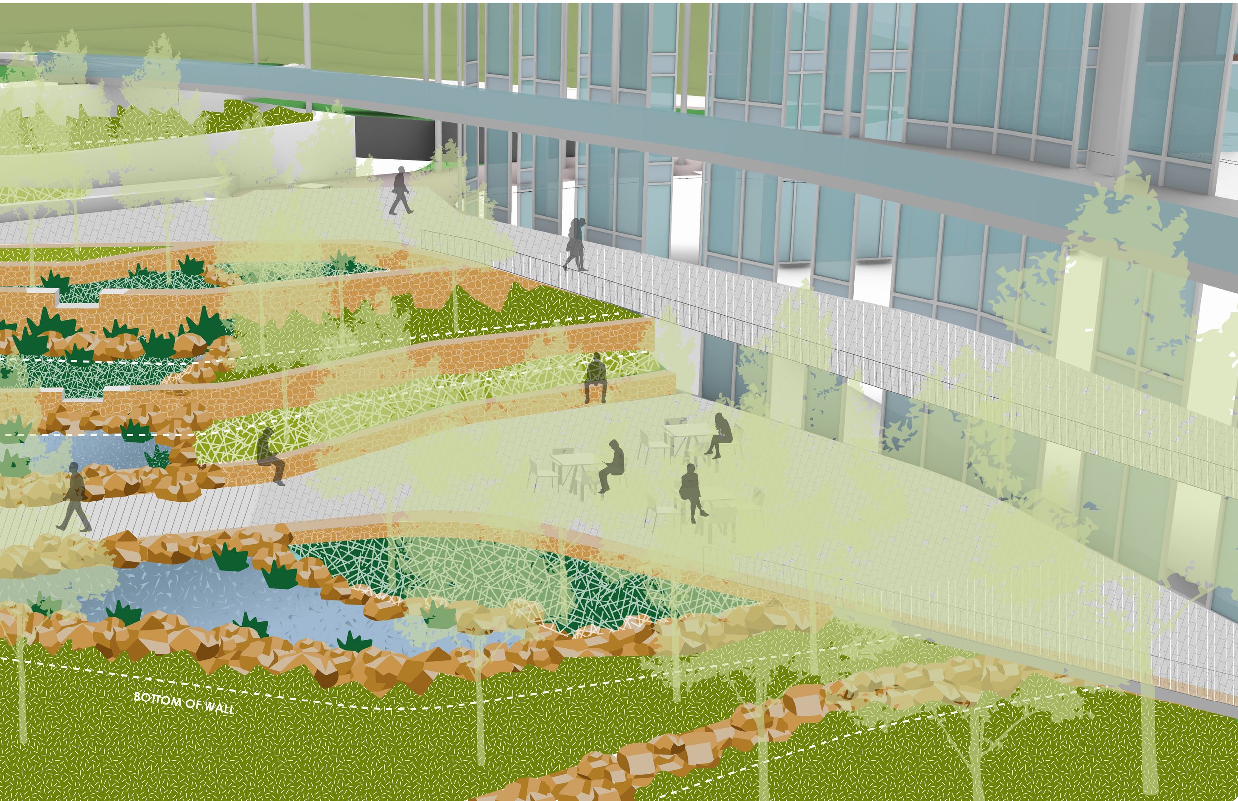
Since the design has a lot of curves and the pathways go in various directions, we wanted to stay away from a brick paver which is highly suggestive of directionality. A hexagonal paver was suggested as an appropriate pavement material for this site. Once we picked the paver shape, we started thinking about pavement patterns. Above are three pavement options we studied that use a 16” hexagonal paver.
DESIGN OPTIONS - TESTING DIFFERENT PAVEMENT SIZES
We studied those same pavement patterns using an 8” hexagonal paver instead of a 16” paver. We projected the 16” and 8” hexagonal pavers onto the 3D model and rendered a view showing what it would look like. The 8” paver worked best.
DESIGN OPTIONS - TESTING PAVEMENT TRANSITIONS
Another detail we thought about was the pavement material transition. The hexagonal pavers are planned to be adjacent to a naturalistic gravel area. How should that transition be? Would a clean, saw cut edge be the best solution? Or should it be the toothed edge of a row of the hexagonal pavers? Or would it be nicest to bring some hexagonal pavers into the gravel area suggesting a blend?
click on the images above and below to see the other pavement options studied
click on the images above and below to see the other pavement options studied
DESIGN DEVELOPMENT (DD)
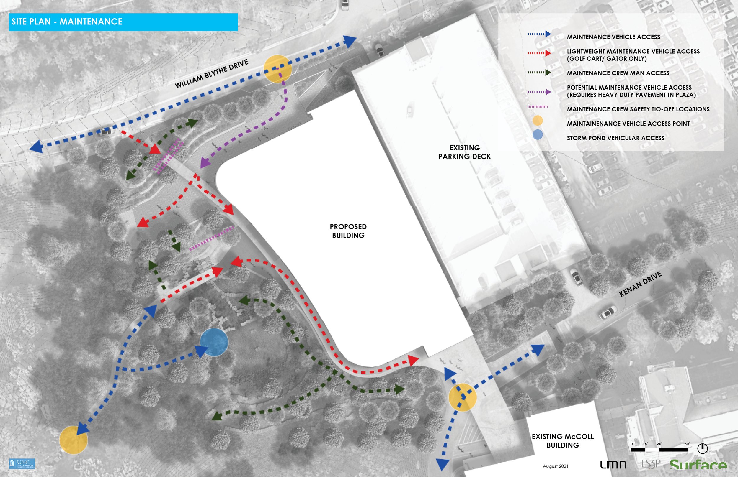
Graphic diagrams continue to be important at the design development stage. To the left and below are some that helped us start the process of construction documentation, which would include materials plans, planting plans, layout plans, and various construction details that all directly depended on the materials we selected.
One of the key design concepts for the landscape became this smooth transition for formal design to nature. We studied materials and material transitions that could help achieve this effect. Closer to the building we would use more ‘polished’ or ‘orderly’ materials such as concrete or brick, and closer to the woods we would use rougher materials like stone, boulder, and gravel. The planting palette was to follow this concept as well, with more formal planting designs being closer to the building and ‘wilder’ plantings suggested for the forest edge.
CONSTRUCTION DOCUMENTATION (CD)
Being involved in this project from advanced planning all the way to construction documentation was an educational and enriching experience. This project occupied a lot of space in my mind for a long time, and the construction documentation phase was exciting because the project was getting much closer to physical reality. I can’t wait to see how the constructed project looks… two years from now.
When I talk about the construction documentation phase to people who are not in the construction and design industry, I explain it as the part of the job where we’re making instructions for the builders. Compare it to the instruction set for Legos or a piece of IKEA furniture.
The construction documentation phase is also a very challenging one because the stakes are higher. While it’s not construction, it’s extremely important to be very technical and precise. As a wise landscape architect once told me, you can easily ‘delete’ lines that represent a wall in CAD, but you can’t easily delete a concrete wall that’s been poured.
I stopped working on this project before we issued the 100% CD set of drawings, so the CD drawings I’ve included here are all in progress.
During the construction documentation phase for the project, I was the landscape BIM manager. I was the one who did most of the drafting (or otherwise directed others to do so). I exchanged .dwg plan files with the architects at LS3P, the civil engineers at NV5, and the electrical engineers at Newcomb and Boyd. I also attended regular meetings with that multidisciplinary design team. To the right are vehicle tracking studies done to make sure that the university’s service vehicles can access the service area. In these particular studies, we showed that a proposed structural column was in conflict with the vehicle paths in the service area.
Just to showcase some of the coordination that I did for this project, I’ve included some studies and markups. One of the coordination markups is highlighting the changes in the landscape after cost estimates came back for our proposed design and it was determined that we needed to reduce the cost (value engineering). The graphic to the left is a markup that indicates where bike racks must be placed for the building to meet LEED Gold standards that have various rules for bicycle placement. Above is a markup for the civil engineer on the project in which we’re trying to coordinate the placement of the utility boxes. They are necessary but not aesthetically pleasing, so we provided alternative locations for stowing them.
Also included below are the in-progress grading plans. The grading on site was adjusted several times throughout design development as we coordinated with the client, architects and engineers. For example, the proposed constructed wetland was re-sized after further calculations by the engineer (which in turn responded to changes in the architect’s design). In another instance, the size of the paved ‘level 1’ plaza was increased after the client decided they needed more outdoor seating spaces for students. A terrace retaining wall was removed from the design in an effort to lower the probable construction cost. All of these changes required adjustments to the grading plans.
